Sunday, 1 April 2018

Wightwick Manor and Gardens


Wightwick Manor and Gardens, located in Wolverhampton, was given to the National Trust by Sir Geoffrey Mander and Lady Mander in 1937 (they continued to live in the house whilst it was open to the public and gave guided tours to visitors).

The manor is home to a collection of pieces from the Arts & Crafts movement and Pre-raphaelite art; De Morgan tiles, William Morris fabric and prints, paintings and artwork by Dante Gabriel Rossetti, Edward Burne-Jones, Ford Madox Brown, Lucy Madox Brown, Evelyn De Morgan, Lizzie Sidal and John Everett Millais just to name a few. Having more artwork on display by female artists than any other National Trust location, I noticed small frames in each room with facts about female artists and discrimination in the UK (staying true to the manor’s roots and heritage…Suffragists meetings were held at the home and Lady Mander was an art writer and collector).

I could have spent hours in each room looking at individual paintings and drawings, furniture and the architecture, there’s so much to take in (I was too busy looking at everything to take photographs). I also think I missed a couple of rooms, a display about the Suffrage movement and the Mander family's connection to India. It’s got an inviting homely lived-in feel and the Manders’ personality and unique taste displays their love and appreciation for art.

It’s worth another visit…maybe on a warmer day.


Sunday, 18 March 2018

Kaleidoscope patterns/textures

Playing around with creating some textures and patterns similar to ones you'd get looking through a kaleidoscope. Not as bright and colourful, more subtle and softer.


Sunday, 11 March 2018

Blue Floral Prints

I've been working on some blue floral prints recently. Still deciding if they look better in another colour scheme. Maybe yellow?


Tuesday, 13 February 2018

Digital Weave Part 1

I've been experimenting with hand stitching recently and naturally its ended up my design work on screen too. Its nothing amazing just yet, I'm looking too incorporate photographs into this...maybe digitally or on paper.

I have always enjoyed weaving and even used it for one of my second year projects at university.  I embossed paper with renaissance inspired patterns I had created by hand and then weaved them into the paper. This was for the Fedrigoni YCN brief back in 2015. Here are some examples below.


Here are geometric shape experiments I worked on this weekend. I'm not exactly sure how I want to organize these as I know I will come back to these ideas with development and more ideas. So maybe for now this can be part 1 with 8/8 and then I can just add additional parts as part of a series.


First experiment with circles


Digital Weave part 1 1/8
 
 
Digital Weave part 1 2/8
Digital Weave part 1 3/8

 
Digital Weave part 1 4/8
Digital Weave part 1 5/8
 
Digital Weave part 1 6/8
 
Digital Weave part 1 7/8

Digital Weave part 1 8/8

Sunday, 11 February 2018

Daily Logo Challenge 7, 8, 9 & 10


Virgo – logo type for a clothing company
 
 
  Mount Blanco - logo type for a ski resort
 
 Pitch - Music streaming start up
 
Light - logo using a flame

Here are days 7, 8, 9 and 10. I've probably been spending around an hour on each one? And this includes initial sketches for the ideas. Each day the emails are giving more prompts to consider, like the audience, the scale of the logo and where it will be used.

 I would always consider this anyway when creating logos. But I feel with this challenge so far I've tried to make myself by more creative in a short space of time without thinking too much about where and how the logo could be used.

Sunday, 4 February 2018

Logo Challenge Day 3, 4, 5 and 6

I forgot to post my logos recently. Here are the ones for days 3, 4, 5 and 6 for the daily logo challenge.


Global Panda logo 


A letter, I chose P for plant pot


Onward - a logo for a driverless car ( looking back at this, I am now aware it looks more like a motorbike tire than car)
.


A coffee shop logo - I created The Coffee Club

Friday, 2 February 2018

Tania Kshah - Brand identity

Here is the final logo and logo mark for Tania Kshah, a bespoke dressmaker who specializes in bridal and evening wear. She wanted a logo that she could use for her brand (not only dresses but jewelry too...and maybe more in the future as she's super creative), something that allows her creations to have full attention and compliment her work. It will be used for her business stationary, advertisements, banners and social media.

Here the final logo, 3 variations using the logo mark and type.


Here are some of the alternative logo marks I came up with.

Information and details about her upcoming launch party and catwalk can be found here.

Monday, 22 January 2018

Daily Logo Challenge - Day 1 & 2


Comet – a rocketship


Crown – hot air balloon
 
 
I started the Daily Logo Challenge this weekend. Its 50 days so I’m going to push myself to make improvements each day with every new theme/name I’m given and be as creative as possible. For the two above, I probably sent 45 minutes in totally, this included sketching ideas first on paper and then moving onto illustrator.
Day 1: Comet – a rocket ship
Day 2: Crown – hot air balloon


Wednesday, 17 January 2018

Film Production Branding


I’ve been working on branding this week, taking inspiration from photography, film and production for the theme of this logo. The final logo will be used on a website and business cards, ect. Here are some sketches and rough designs on illustrator that I’m currently working on.


Sunday, 7 January 2018

Rebrand Sketches


Here are some pictures of a rebrand I’m working on, a local designer who specialises in bespoke and custom made dresses. I’m still at the beginning stages of the process and fixing the current logo that is being used.
They want something that is clean and simple that could also be used in the future for other areas of their brand.

Friday, 23 June 2017

Busy Bee - paper making, with seeds!


Busy Bee was a brief that I wrote myself for my final major project at university in my final year. I’ve posted about this on Instagram and on its on my website too. I decided to tackle the issue of helping honey bees in the UK and growing more flowers.

From my website: ‘Busy Bee is a campaign to encourage busy commuters to grow flowers on their daily commute to help the honey bee population. The handmade paper made from recycled train tickets and specially chosen seeds for honey bees was transformed into coffee cup wraps, posters and an information booklet; all of which can be grown. All products were screen printed and would use environmentally friendly ink.
The campaign would rely on commuters handing in their old train tickets to coffee shops that supported Busy Bee and would in turn get a coffee cup wrap. The website design for mobile would allow users to locate the nearest coffee shop.’

More about the background and research for this project can be found on my website here.

The paper making process
I’m a hoarder. I hoard things. Things I don’t want to throw away, things people have given me, things I have picked up when I’ve gone somewhere, nice things, old receipts and tickets, scrap bits of paper I can't bare throw away ect. So I have a whole bag for life of paper from my 3 years at uni that I thought might come in use one day. And I made sure I was going to use it, especially for this project. I’ve always been intrigued by paper making since I created the Upcycle project at college and wanted to create some of my own. I remember one summer 3-4 years ago I spent ages going from shop to shop trying to find mesh to make a frame that my dad said he would help put together but I had no luck finding the correct mesh I needed. Until later on, I gave up and bought an A5 mesh from ebay. And its been perfectly fine (no idea why I didn't do that first). The only problem I found was joining the sheets together to make A4 or A3 sheets of paper.

Here are pictures from the process. Not all of the photos are form the same batch and some are from different days. I really didn't want to get water or paper pulp on my camera!
Last December I collect a whole loads of petals from flowers we were about to throw away. Dried them out and kept them in plastic bags. This is a picture of some of them in the blender.

I don’t have correct measurements of how much water I added, or starch, or seeds or the amount paper. I did them all in the different batches, added them to a tub and added extra water if needed. Here is a picture of all the train tickets I added to the mixture. I blended until only for a few seconds, if the water is warm it breaks the paper down quicker and you don’t want the paper to be too fine else it will pass through the mesh.


I added at least 3 batches of paper and water to a tub and added extra water if the mixture was too thick. Once I had the right consistency, I added starch and seeds. I had chosen specific seeds to attract bees so that it related to purpose of my project. The starch makes the paper stronger and this is exactly what I needed as I was going to make booklets, coffee cup wraps and posters.

I then dipped the frame into the water, slowly lifted it up and let the water drain on the side. I then pressed the pulp down with a sponge until most of the water was gone and carefully place the pulp square onto plastic and cardboard to dry.

It took at least 2-3 days to dry properly.

I have some spare paper left so I will test this outdoors over the summer. The small plant pot I tests out a sample of died within a few days, simple because I don’t have much sunlight in my room and where my window is positioned.
Also in the picture above...that's not soil...its tea! From used teabags (that's another story in itself).

Tuesday, 20 June 2017

Graphic Design Degree Show 2017


So two days left for the public to come and view our degree show at university. Its open from 10am till 7pm on Wednesday and 10am till 5pm on Thursday. I’ve been trying to promote this on Twitter as much as I can without getting too annoying.

Friday was the opening night; it went well. Busy with people from industry, lots of friends and family all in the Queen’s building at DMU.
I’ve enjoyed working in Queen’s, got use to the unusual shape of the studio, the little bridges that connect all of the room, creative atmosphere and equipment I’ve had access to. Although sometimes I’ve needed a change of atmosphere and walked over to the new Vijay Patel building which has so many spaces to sit and work so that’s been nice too.
I was head of the publicity team for this year’s degree show and we started having meetings in early October organised by my tutor. As a group, we decided on the theme of ‘Set Sail’. Holding the meaning of starting a new journey as we all embark on a new chapter after graduating. This is third year we have been allowed to choose a theme. In previous years it has just been the year, for example ‘Degree show 2012’. I’ll write a full post about degree show organising, designing, fundraising, social media and all of the stuff in between once its completely over J
Our website is www.setsail2017.co.uk Instagram and Twitter is: @SetSail2017 and the hashtag everyone on the course has been using is #SetSail2017
Elliot Priestley created the website whilst being on the team with us. Any updates we had as the design team, he got them done to keep everything consistent, and an all-round great guy ( @elliotpriestley )!
Amy Sarfas has been looking after the Instagram account and has been the other half of the design team for the degree show.
This is my degree show board, featuring my Final Negotiated Project, Major Negotiated Project, competition brief (The Practical Printer and G.F Smith), an ipad with my website, portfolio pages, CV and business cards. I’ll upload each project in full as a separate post as I feel they deserve a post each.


Also got given a sunflower for being a part of the team from the tutors. Here is a picture of Ramella, Amy and I with our sunflowers. At first I wasn't sure if I liked this photo, but this is probably the happiest I've looked in months! So yeah, I like this photo :) Photo of us taken by Sunny Singh, whose work is amazing! and can be found here on Instagram @graphicsunny and same for Twitter.


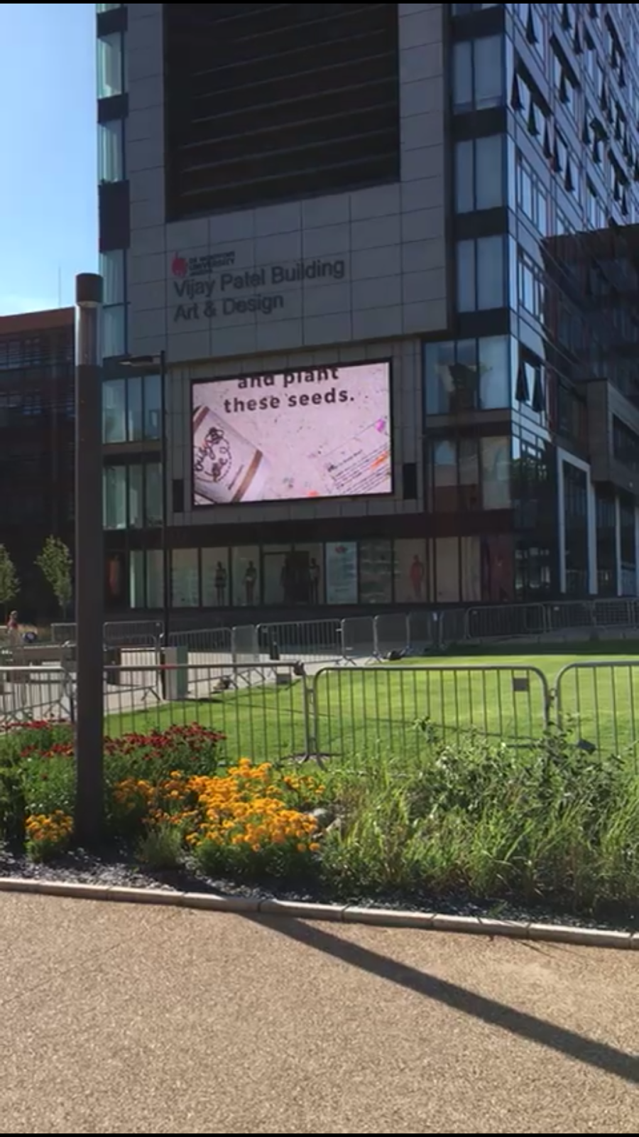
I also got featured in the technology degree show book about my experience on the course and my work could be seen on screen throughout campus and on the big screen outside the Vijay Patel building!


Here are some more photos from the night! A little bit blurry!
Announcements and speeches downstairs!


Awards about to get announced for students and displays.

Ollie won some award for student achievement or something like that, what a guy.

Joe repping my work and Set Sail stickers Chris Edwards ( @_c_edwards ) designed for the show.

 
 Elliot having his photo taken...how fancy! Also had my photos taken and they were very cheesy so I'm not looking forward to the day I have to see them. In fact they may never get used so that's okay ahaha.